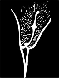
The erotics of type
From the simple figure 69, to elaborate tongue-in-cheek exercises like Michael Worthington’s ‘Dominatrix’ typeface, typographers and type designers as well as readers (and censors) have used letters and ciphers to suggest ‘prurient’ content. Throughout the history of typography, the ‘abstract’ medium of type is employed to evoke eroticism, not by merely using the obvious words, but by using the letterforms: Copulating letters, erotic ligatures and the dot.